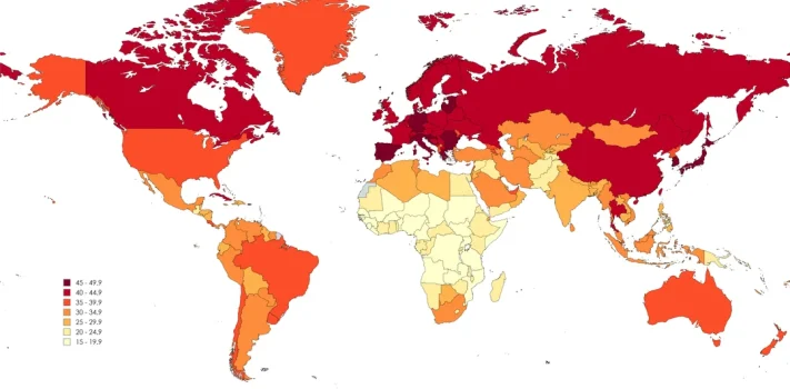
SurvivalBlog Graphic of the Week
Today’s graphic shows the median age by country, according to the CIA’s World Factbook. (Graphic courtesy of Reddit.) The thumbnail image below is click-expandable. — Please send your graphic ideas to JWR. (Either via e-mail or via our Contact form.) Any graphics that you send must either be your own creation or uncopyrighted.