
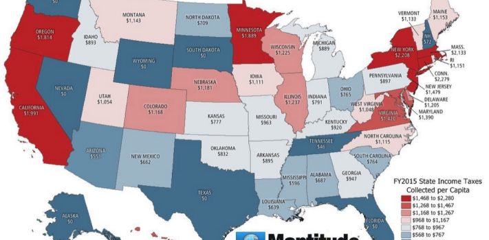


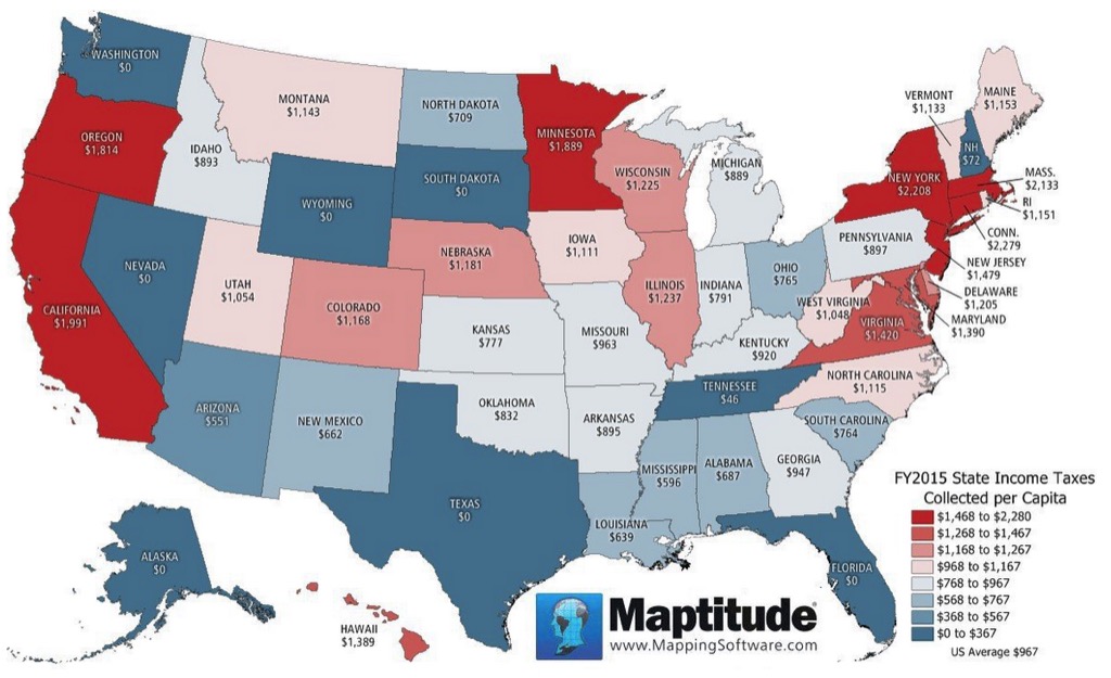
Today’s graphic is a map that shows States with the Highest and Lowest Per Capita State Income Taxes. Note that this map uses data from 2015. Taxes have increased substantially since then, but the relative differences between the states are still about the same. (Graphic courtesy of Maptitude / Caliper.com.)
The thumbnail image below is click-expandable, for detailed viewing.
—
Please send your graphic ideas to JWR. (Either via e-mail or via our Contact form.) Any graphics that you send must either be your own creation or uncopyrighted.