SurvivalBlog Graphics of the Week

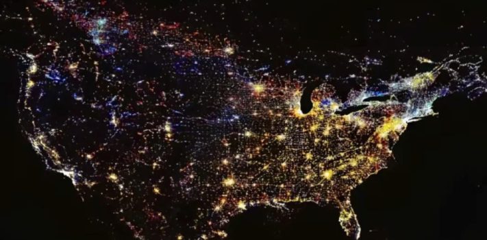
Today’s graphics:  Light Pollution, Around the World. (Graphics courtesy of Reddit.) The thumbnails below are click-expandable.  We usually post just one graphic each week, but this set of color images was so fascinating that we chose to post the full set. In the image of East Asia, note the dark spot, for North Korea. Truly, a picture tells a thousand words. – JWR                                       — Please send your graphics or graphics links to JWR. (Either via e-mail or via our Contact form.) …


SurvivalBlog Graphic of the Week

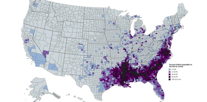
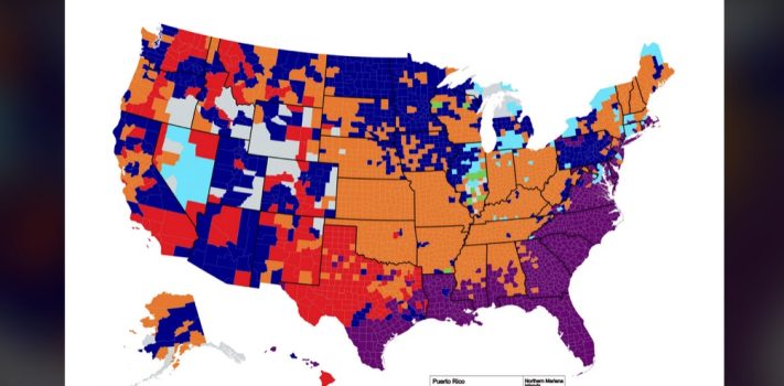
Today’s graphic:  Which Counties are the least diverse (most homogeneous)? Graphic courtesy of Reddit, based on U.S. Census Bureau data. The thumbnail below is click-expandable.         — Please send your graphics or graphics links to JWR. (Either via e-mail or via our Contact form.) Any graphics that you send must either be your own creation or uncopyrighted.
SurvivalBlog Graphic of the Week

SurvivalBlog reader D.S.V. pointed us to today’s graphic:  Map of America’s Abandoned Railroad Tracks. (Graphic courtesy of the fascinating  Forgotten Lands, Places and Transit website.) The thumbnail below is click-expandable.     Or, better yet, open the map directly in Google Maps, for a nice detailed and zoomable view. — Please send your graphics or graphics links to JWR. (Either via e-mail or via our Contact form.) Any graphics that you send must either be your own creation or uncopyrighted.


SurvivalBlog Graphic of the Week

Today’s graphic: Death By Starvation: A simulation estimates the proportion of the population to die from starvation following nuclear war. (A Times of London/Sunday Times graphic, courtesy of Reddit.) JWR’s Comment:  This is a simulation that assumes a worst-case full nuclear exchange, an interruption of most commerce, and the death of most livestock. This underscores the importance of having a deep larder! The thumbnail below is click-expandable.         — Please send your graphics or graphics links to JWR. (Either via e-mail or via our Contact form.) Any graphics that you send must either be your own creation …


SurvivalBlog Graphic of the Week

Today’s graphic: The “Stickiest” States: Showing the share of people born in each state who were still living there, as of 2021. (Graphic courtesy of Reddit. Based on Dallas Federal Reserve Bank statistics, via the U.S. Census Bureau.  Map created by Kavya Beheraj/Axios.) JWR’s Comment: The low numbers in Wyoming, Alaska, and Hawaii say a lot about differences in both climate and job opportunities. The thumbnail below is click-expandable.       — Please send your graphics or graphics links to JWR. (Either via e-mail or via our Contact form.) Any graphics that you send must either be your own …


SurvivalBlog Graphic of the Week

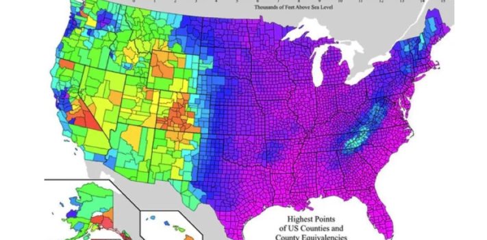
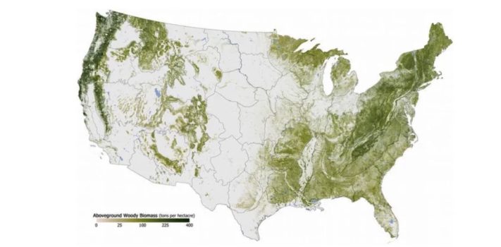
Today’s graphic:  Geography of the Continental United States. (A “cstats1” graphic, courtesy of Reddit.)  This exaggerated view helps to illustrate why The American Redoubt is so redoubtable. The thumbnail below is click-expandable. <<<Insert Thumbnail Image >>       — Please send your graphics or graphics links to JWR. (Either via e-mail or via our Contact form.) Any graphics that you send must either be your own creation or uncopyrighted.