
SurvivalBlog Graphic of the Week 

Today’s graphic:  USDA Plant Hardiness Growing Zone Chart. (Graphic courtesy of Oregon State University (OSU) and the U.S. Department of Agriculture (USDA). The thumbnail below is click-expandable.       — Please send your graphics or graphics links to JWR. (Either via e-mail or via our Contact form.) Any graphics that you send must either be your own creation or uncopyrighted.
SurvivalBlog Graphic of the Week

Today’s graphic:  Map of Tree Canopy Cover in the United States. (Graphic courtesy of the USDA.) For the full dataset with useful variant raster maps, see: https://data.fs.usda.gov/geodata/rastergateway/treemap/index.php The thumbnail below is click-expandable.       — Please send your graphics or graphics links to JWR. (Either via e-mail or via our Contact form.) Any graphics that you send must either be your own creation or uncopyrighted.


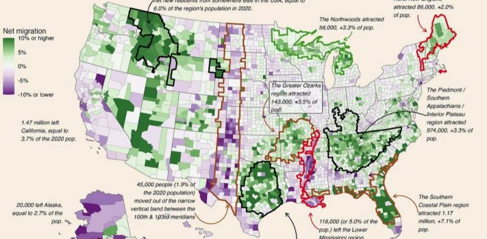
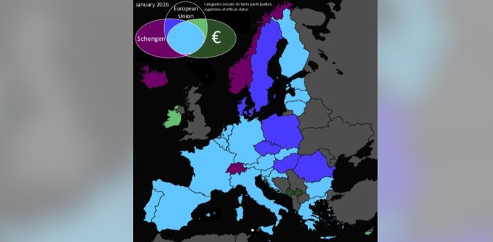
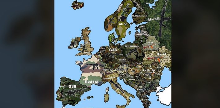
SurvivalBlog Graphic of the Week 

Today’s graphic: A map showing the annual property tax bill for owning a median-priced home in that US state. (Graphic courtesy of Reddit.) The thumbnail below is click-expandable.       — Please send your graphics or graphics links to JWR. (Either via e-mail or via our Contact form.) Any graphics that you send must either be your own creation or uncopyrighted.


SurvivalBlog Graphic of the Week

Today’s graphic: Map of Nunavut. (Graphic courtesy of Reddit.) Nunavut (population 41,000) is the Largest Electoral District On Earth. It is 8 Times Larger Than The UK. The thumbnail below is click-expandable.         — Please send your graphics or graphics links to JWR. (Either via e-mail or via our Contact form.) Any graphics that you send must either be your own creation or uncopyrighted.


SurvivalBlog Graphic of the Week

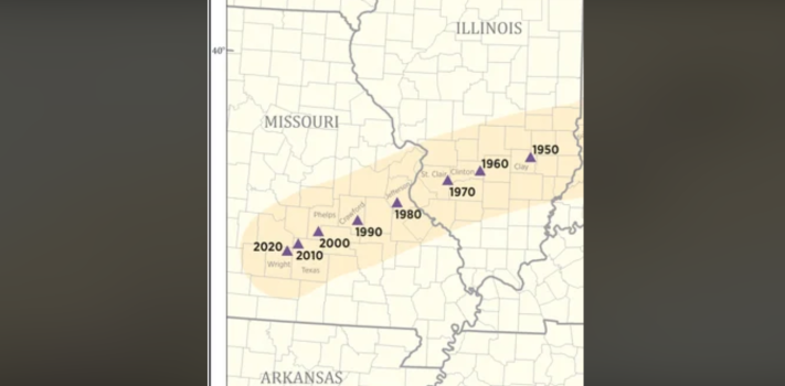
Today’s graphic: Time of First Permanent European/European Descendant Settlement Within Modern-Day State Boundaries. (Graphic courtesy of Reddit.) The thumbnail below is click-expandable.       — Please send your graphics or graphics links to JWR. (Either via e-mail or via our Contact form.) Any graphics that you send must either be your own creation or uncopyrighted.


SurvivalBlog Graphic of the Week

Today’s graphic:  Map showing the percentage of adults who are homeowners, by U.S. state. (A Civic Science graphic, courtesy of Reddit.) The thumbnail below is click-expandable.         — Please send your graphics or graphics links to JWR. (Either via e-mail or via our Contact form.) Any graphics that you send must either be your own creation or uncopyrighted.


Graphic of the Week:

Today’s graphic:  A map showing that 95% of ocean plastic originates from 10 rivers in Asia and Africa. (Graphic courtesy of Reddit.) The thumbnail below is click-expandable.     — Please send your graphics or graphics links to JWR. (Either via e-mail or via our Contact form.) Any graphics that you send must either be your own creation or uncopyrighted.


SurvivalBlog Graphic of the Week

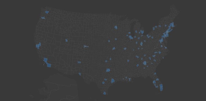
Today’s graphic:  Map of the Largest Metropolitan Areas in the United States. (Graphic courtesy of Reddit.)  Note that only one of them touches the edge of the American Redoubt region. The thumbnail below is click-expandable.         — Please send your graphics or graphics links to JWR. (Either via e-mail or via our Contact form.) Any graphics that you send must either be your own creation or uncopyrighted.


SurvivalBlog Graphic of the Week

Today’s graphic: Map of Lead Service Lines per Public Water System. (Graphic courtesy of Reddit.) The thumbnail below is click-expandable.         Reader Robert W. had these comments: “Pretty good fit, eh? This needs a real scientific study. The correlation is just too strong to be coincidence. It’s been long asserted that Romes decline was due in part to its lead pipes, so there’s considerable precedent. Could lead poisoning/brain damage lead to half the voters being disqualified for medical cause? Maybe the real reason cities lean democrat is because of lead poisoning.” Also see this map: The Real Reason …