SurvivalBlog Graphic of the Week

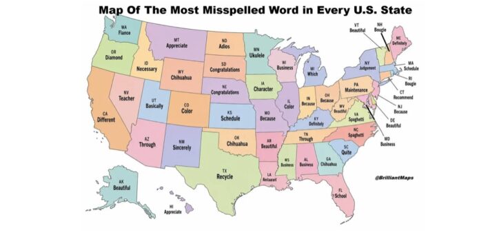
Today’s graphic is a map that shows the most often misspelled word in each state.  No offense, but I had to chuckle when I saw that “School” was the tough one, for Floridians. (Graphic courtesy of Reddit.) The thumbnail image below is click-expandable.         — Please send your graphic ideas to JWR. (Either via e-mail or via our Contact form.) Any graphics that you send must either be your own creation or uncopyrighted.
SurvivalBlog Graphic of the Week

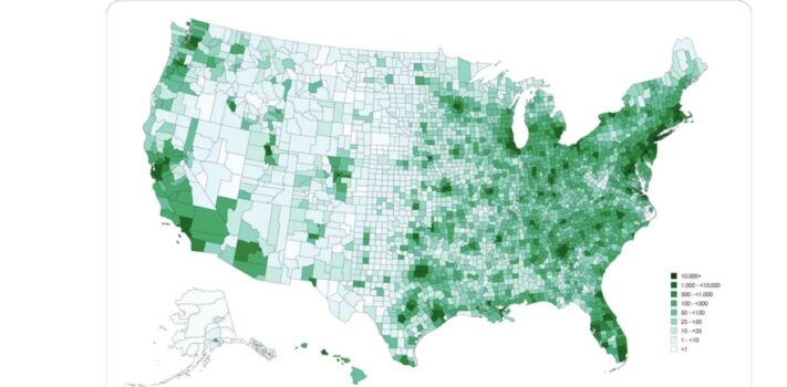
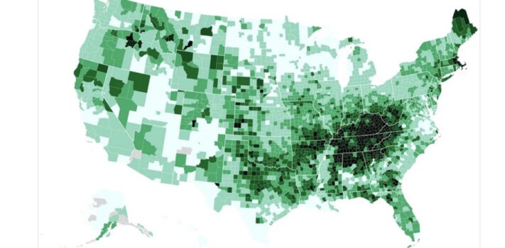
This week’s graphic is a map that shows the population density of U.S. counties, as of 2026.  Every  prepper knows that in a crisis, fewer people generally means fewer problems. Note the low population density in the American Redoubt. There is only one county in the entire American Redoubt region that is shaded dark green. That is Ada County, Idaho, with 519,000 people. For perspective, that is just a bit more than Raleigh, North Carolina. Ada County’s population includes the roughly 236,000 residents inside the city limits of Boise. – JWR The thumbnail image below is click-expandable. (Graphic courtesy of …


SurvivalBlog Graphic of the Week

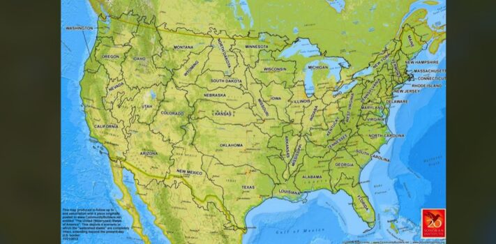
Today’s graphic is a map showing the United States divided by watersheds, as proposed by explorer, cartographer, and USGS Director John Wesley Powell. (Graphic courtesy of Reddit and the Sonoran Institute.) The thumbnail image below is click-expandable. — Please send your graphic ideas to JWR. (Either via e-mail or via our Contact form.) Any graphics that you send must either be your own creation or uncopyrighted.


SurvivalBlog Graphic of the Week

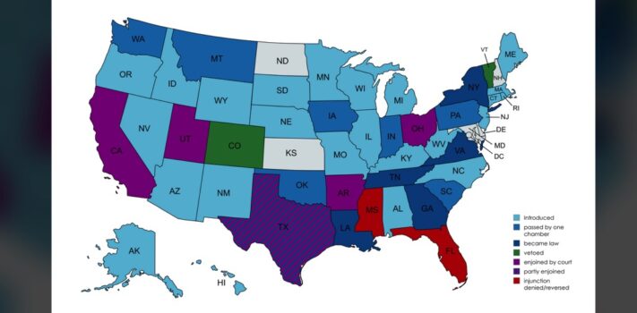
Today’s graphic is a map that shows the status of social media age verification legislation around the United States. (Graphic courtesy of Reddit.) The thumbnail image below is click-expandable.       — Please send your graphic ideas to JWR. (Either via e-mail or via our Contact form.) Any graphics that you send must either be your own creation or uncopyrighted.


SurvivalBlog Graphic of the Week

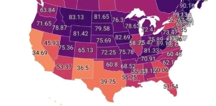
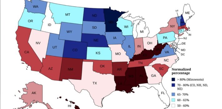
Today’s graphic is a map that shows the white population distribution by percentage throughout the American states and Canadian provinces. (Graphic courtesy of Reddit.) The lower detail map shows the small northeastern states. The thumbnail images below are click-expandable.           — Please send your graphic ideas to JWR. (Either via e-mail or via our Contact form.) Any graphics that you send must either be your own creation or uncopyrighted.


SurvivalBlog Graphic of the Week

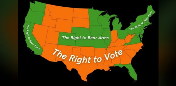
The week’s graphic shows the results of a US opinion poll on which rights someone would rather lose. (Graphic courtesy of Reddit.) JWR’s Comments: This poll illustrates two things: 1.) The visceral reaction of liberals, and 2.) The failure of liberals to realize that we can always “vote from the rooftops” (or, more tactically, vote from behind the treelines.) The thumbnail image below is click-expandable. — Please send your graphic ideas to JWR. (Either via e-mail or via our Contact form.) Any graphics that you send must either be your own creation or uncopyrighted.  


SurvivalBlog Graphic of the Week

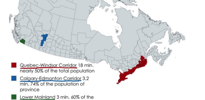
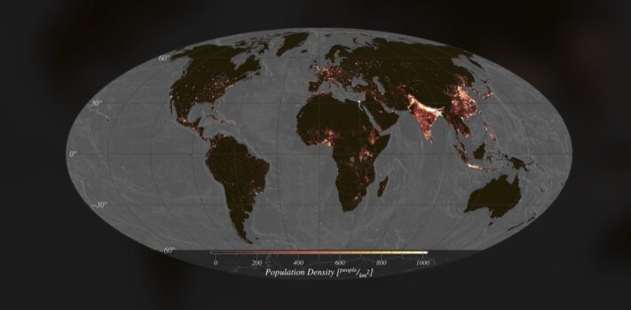
Today’s graphic: 70% of Canada’s population lives in these three regions. “Around 300,000 km² from 9,984,670 km² of total area of Canada, but 70% of population lives here…” (Graphic courtesy of Reddit.) The thumbnail below is click-expandable. — Please send your graphics or graphics links to JWR. (Either via e-mail or via our Contact form.) Any graphics that you send must either be your own creation or uncopyrighted.


SurvivalBlog Graphic of the Week

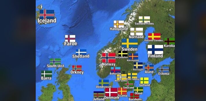
Today’s graphic: Normalized product of inverse of Cost of Living and Human Development Index (HDI) based on 2026 Cost of Living data. JWR’s Comments:  Note that the Human Development Index has been criticized for a Scandi-centric view of health, wealth, and happiness. The HDI’s 0-to-1 ratings essentially assume that present-day Scandinavia is the penultimate in civilizational aspirations. I, for one, can imagine something a lot better than multi-generational welfare dependence. Also note that the current prosperity of Norway, the UK, the Netherlands, Denmark, and Germany has partly been artificially propelled by the cash generated by drilling North Sea oil. The …


SurvivalBlog Graphic of the Week

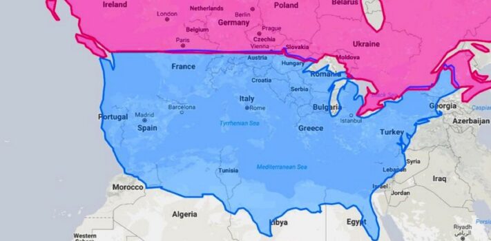
Today’s graphic: A map showing the United States and Canada, with comparable latitude locales in Europe overlaid. (Graphic courtesy of Reddit.) The thumbnail below is click-expandable.   — Please send your graphics or graphics links to JWR. (Either via e-mail or via our Contact form.) Any graphics that you send must either be your own creation or uncopyrighted.


SurvivalBlog Graphic of the Week

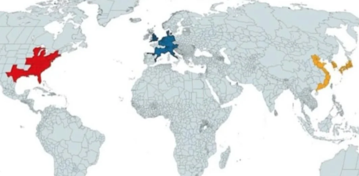
Today’s graphic: Global GDP Clusters. These three regions, spread across three continents, together generate half of the world’s GDP  (Graphic courtesy of Reddit.) The thumbnail below is click-expandable.   — Please send your graphics or graphics links to JWR. (Either via e-mail or via our Contact form.) Any graphics that you send must either be your own creation or uncopyrighted.