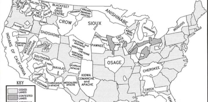
SurvivalBlog Graphic of the Week
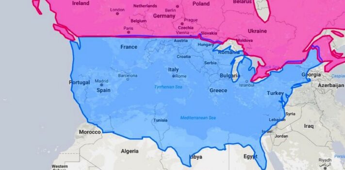
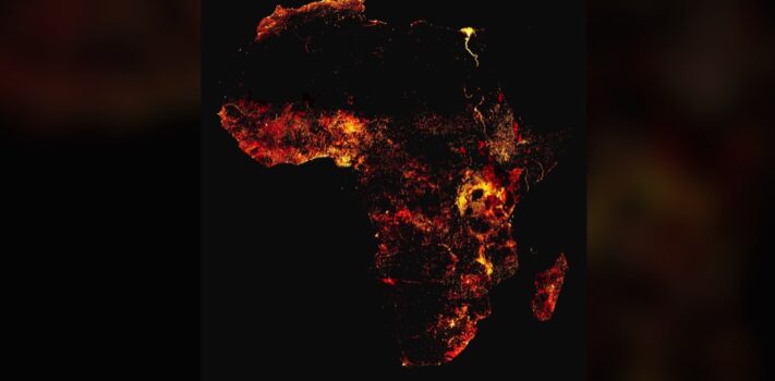
Today’s graphic is a map that shows the population density of Africa and Madagascar. Take note of the dark areas (mostly deserts) and the trace of the Nile river valley and delta. (Graphic courtesy of Reddit.) The thumbnail image below is click-expandable. — If any SurvivalBlog readers have personally taken or otherwise hold the copyright to a particularly nice landscape photo or other photo of particular interest to preppers that is in a wide horizontal format (to match our blog template) then please send it in as an e-mail attachment, and I will consider posting it as …