
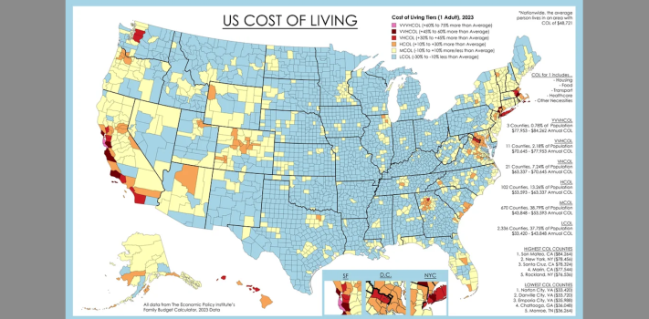


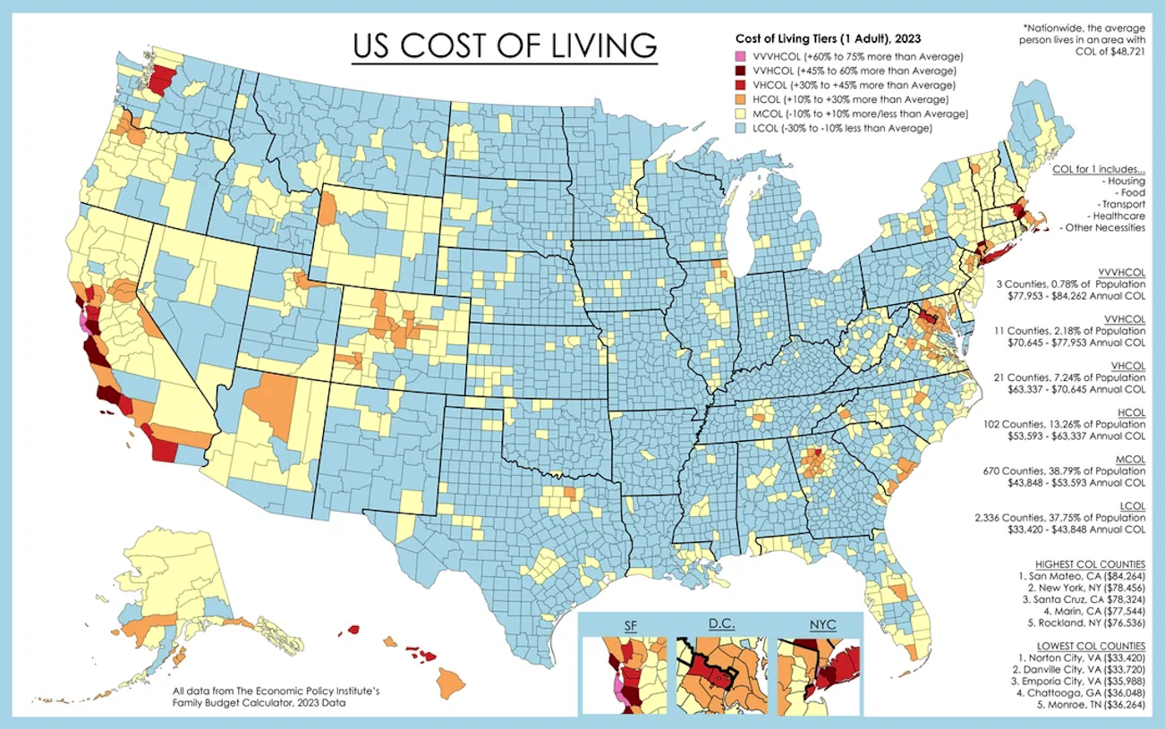
Today’s graphic is a map that shows U.S. Cost of Living, By County.
(An Economic Policy Institute graphic, by way of Reddit.)
The thumbnail image below is click-expandable.
—
Please send your graphic ideas to JWR. (Either via e-mail or via our Contact form.) Any graphics that you send must either be your own creation or uncopyrighted.