SurvivalBlog Graphic of the Week
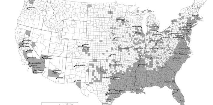
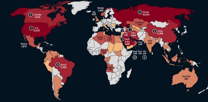
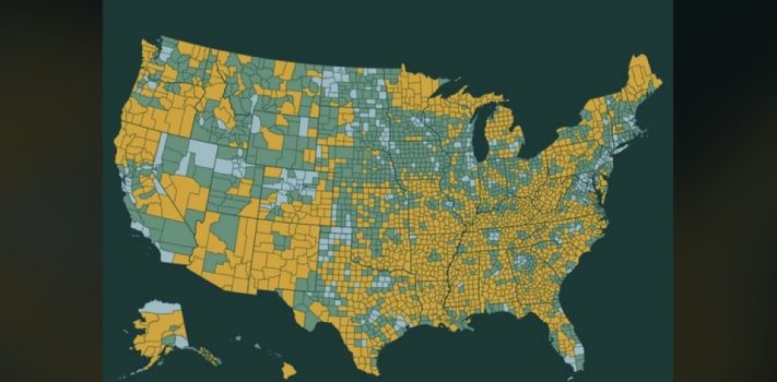
Today’s graphic: Map showing Personal Income From Government Transfers (Graphic courtesy of Reddit.) Note that this includes government employee paychecks, military pensions, and Social Security. The thumbnail below is click-expandable. — Please send your graphic ideas to JWR. (Either via e-mail or via our Contact form.) Any graphics that you send must either be your own creation or uncopyrighted.