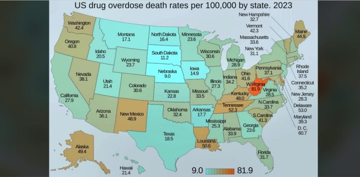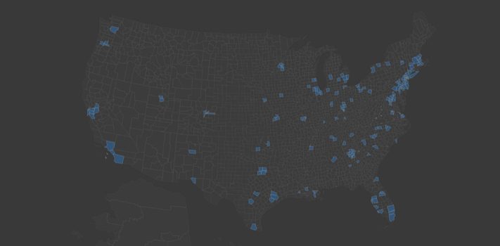
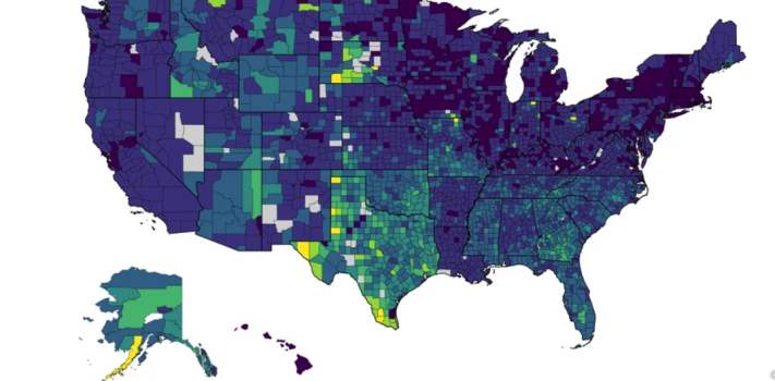
SurvivalBlog Graphic of the Week
Today’s graphic: Percent of Population without Health Insurance, by County (U.S.). (Graphic courtesy of Reddit and ZipCrawl.) The thumbnail below is click-expandable. From the ZipCrawl website: NOTE: Gray indicates insufficient data or a suppressed estimate. Explore the geographic distribution of uninsured Americans across every county in the United States. This map traces the consequences of Medicaid expansion decisions, immigration patterns, and labor market structures – revealing how a single state policy choice created dramatic coverage disparities at state borders, and how the Texas-Mexico corridor has become the uninsured capital of the developed world. JWR Adds: Illegal immigration is …