


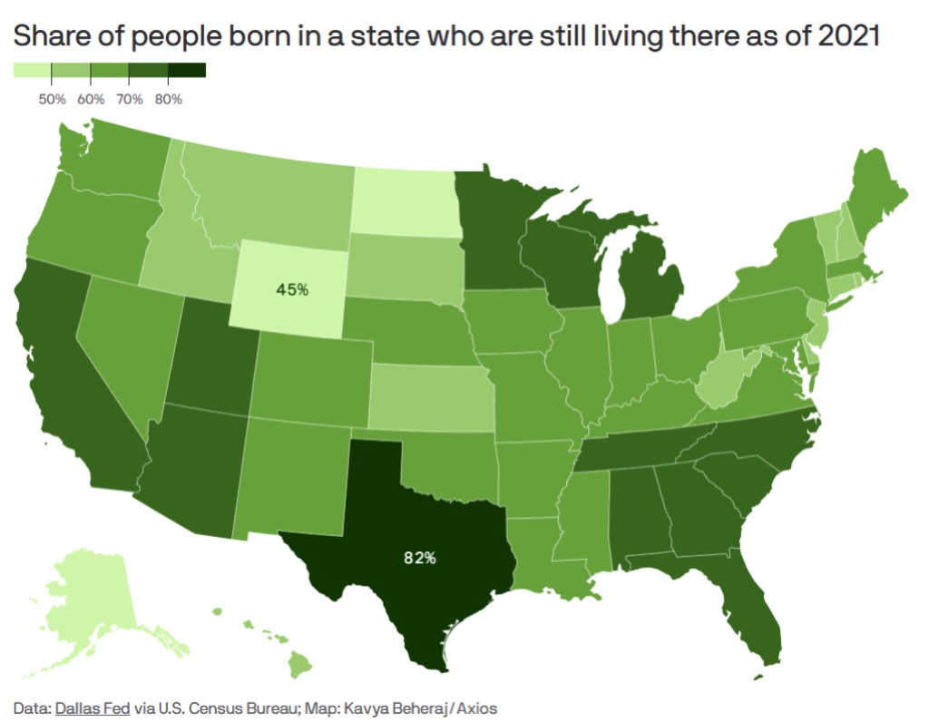
Today’s graphic: The “Stickiest” States: Showing the share of people born in each state who were still living there, as of 2021. (Graphic courtesy of Reddit. Based on Dallas Federal Reserve Bank statistics, via the U.S. Census Bureau. Map created by Kavya Beheraj/Axios.)
JWR’s Comment: The low numbers in Wyoming, Alaska, and Hawaii say a lot about differences in both climate and job opportunities.
The thumbnail below is click-expandable.
—
Please send your graphics or graphics links to JWR. (Either via e-mail or via our Contact form.) Any graphics that you send must either be your own creation or uncopyrighted.