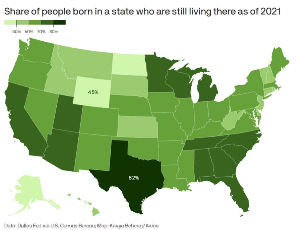
Today’s graphic: The “Stickiest” States: Showing the share of people born in each state who were still living there, as of 2021. (Graphic courtesy of Reddit [1]. Based on Dallas Federal Reserve Bank statistics, via the U.S. Census Bureau. Map created by Kavya Beheraj/Axios.)
JWR’s Comment: The low numbers in Wyoming, Alaska, and Hawaii say a lot about differences in both climate and job opportunities.
The thumbnail below is click-expandable.
 [2]
[2]
—
Please send your graphics or graphics links to JWR [3]. (Either via e-mail or via our Contact form [4].) Any graphics that you send must either be your own creation or uncopyrighted.