


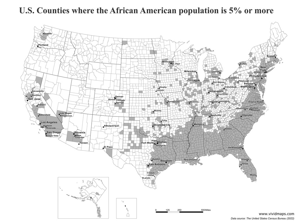
Today’s graphic: A map showing U.S. Counties where the African American population is 5% or more. (Graphic courtesy of Reddit.)
The thumbnail below is click-expandable.
—
Please send your graphic ideas to JWR. (Either via e-mail or via our Contact form.) Any graphics that you send must either be your own creation or uncopyrighted.