


In Economics & Investing Media of the Week we feature photos, charts, graphs, video links, or occasional news items of interest to preppers.
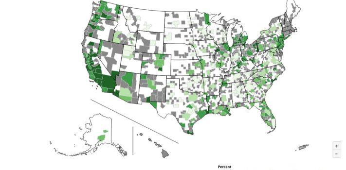
The map image below, showing Unemployment Rates, By County is from Bureau of Labor Statistics (BLS) data, posted for unrestricted use by the St. Louis Federal Reserve Bank. It is click-expandable.
For a detailed and zoomable view, see: https://fred.stlouisfed.org/graph/?m=1wm8j
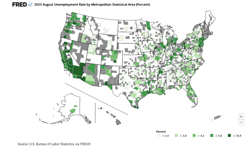
And here is some related data that explains some of the gray-shaded patches seen in the otherwise low-unemployment western states: Native American Labor Market Dashboard.
—
Reader T.M wrote to recommend the book by Peter Krauth.
Other Links of Interest
- Blog Editor Tom Christianson suggested this sobering piece: The Cost of Financing U.S. Government Debt.
- Mining Makes An American Comeback.
- Reader DSV mentioned this at Zero Hedge: From Store of Value to Paper Claim: Why Currency Isn’t Money.
- Seattle Paying Up To 53% More Than The National Average For Gasoline.
Economics & Investing Media Tips:
Please send your economics and investing media link to JWR. (Either via e-mail or via our Contact form.) Thanks!