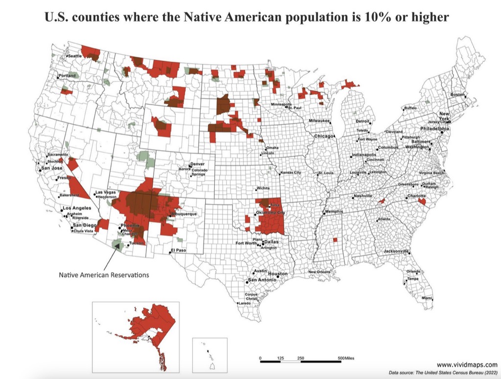
Today’s graphic: A map showing U.S. counties where the Native American population is 10% or higher. (Graphic courtesy of Reddit [1]and VividMaps.com [2].
JWR’s Comments: Though there is no graphic color key provided, it appears that the color red indicates where the Native American population is 10% or higher, the color green indicates tribal reservations, and the color brown indicates the areas within reservation boundaries where their population is 10% or higher.
For a more detailed map of reservations, by name, see: https://commons.wikimedia.org/wiki/File:Bia-map-indian-reservations-usa.png [3]
The thumbnail below is click-expandable.
 [4]
[4]
—
Please send your graphic ideas to JWR [5]. (Either via e-mail or via our Contact form [6].) Any graphics that you send must either be your own creation or uncopyrighted.